There are so many published books out there that finding ugly dust jackets in the remote outer space of the literary realm is both too easy and too cruel. This list is limited to well-known and highly-regarded books whose jackets could and should have been prettier. It's no secret that the aspirant connoisseur's aesthetic judgment is oftentimes contaminated by a personal affection for a book or by a recognition of a book's significance and he or she is thus wont to regard a thing as better-looking than it really is. Untroubled by this shortcoming, I hereby offer my judgment to show you the books that really do have the ugliest dust jackets.
10. The Harry Potter Books
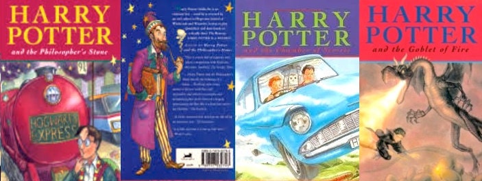
I don't want to offend anyone, but you can tell right away just by looking at the dust jackets that these books are for babies. I will admit that the Candyland Bingo color scheme and Anklepants typeface would be excellent design elements for, say, a toilet paper mascot, but the art for the "Potter" dust jackets looks like Professor Dumbledore put down too much Beefeater over spring break and barfed up a couple baskets of Easter eggs.
9. Beloved by Toni Morrison
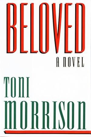
The taciturn titular styling on this book won't give you any help in figuring out what "Beloved" is all about. Then again, neither will reading the book.
8. Live and Let Die by Ian Fleming
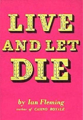
It's pretty crazy how the best Bond book has the worst jacket, right? I know, I know: it's the worst book. (Worst song too.) A sparse typographical-oriented design can make a powerful statement when it's done well (e.g. the dust jacket to "Psycho") but this purple-and-yellow number set in Leatherstocking font scores a big double-oh zero.
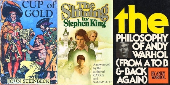
7. Cup of Gold by John Steinbeck
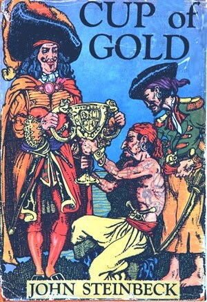
The dust jacket pirates on this cover look like they walked the plank straight off the label of Admiral Nelson's eight dollar off-brand rum. Let's just say the trophy on the cover isn't for this book's jacket artistry.
6. All Books by Cormac McCarthy
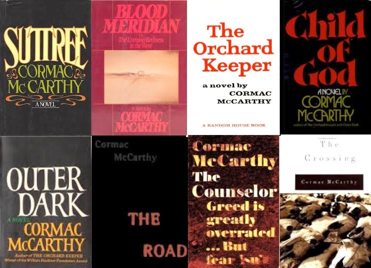
Cormac McCarthy deserves some credit for attaining a high degree of critical esteem and popularity in the book-writing profession on the basis of a slate of books that, jacket-wise, are on the bad side of the blood meridian.
5. The Shining by Stephen King
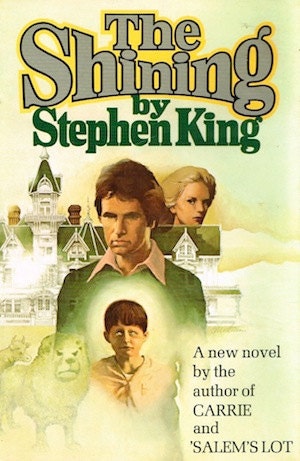
The entire oeuvre of Stephen King dust jacket art is pretty bad. "The Stand" is probably his best dust jacket (and is the last with the title above his name) but for some reason the art landscape on that jacket is chopped off of the spine--probably on account of the publisher's pecuniary habits (Doubleday production value was often sub-book club edition). "The Shining," on the other hand, released just a year earlier, is almost his worst (but see below). It seems as though the artists couldn't decide if they wanted to go with a "Peyton Place" look or a "Star Wars" look and decided to compromise.
4. The Later Hunter S. Thompson
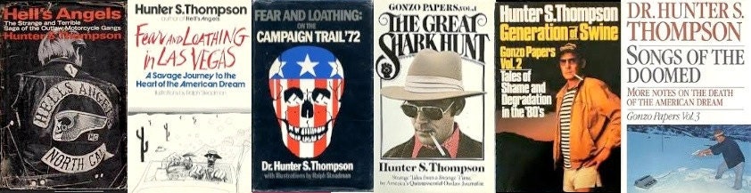
Hunter's dust jacket art tracks an unswerving trajectory from not bad to really bad, which--here comes a surprise!--is the same course his writing took and at the same speed.
3. The Movie-Goer by Walker Percy
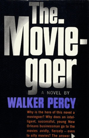
If I were sent on a scavenger hunt directly from John Rawls' spawning hut with instructions to find a book that looked like it would be crappier than a Jackie Collins novel, I'd feel pretty confident going with "The Movie-goer." I'd be wrong, but "The Movie-goer" is one of those "high point" books that still makes any shelf it's added to look worse, no matter what the other books on the shelf are.
2. The Gunslinger by Stephen King
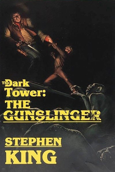
This is another artistic felony from repeat-offender Stephen King. "The Gunslinger" dust jacket resembles one of those comically deceptive video game covers for early home consoles that promised you a and gave you b (below).

And the typography. "Hey boss, we were wondering: should we underline the author's name?"
"Just his first name."
Although "The Gunslinger" is a book that is better than its cover, I have to ask, how could it not be?
1. The Philosophy of Andy Warhol (from A to B & Back Again) by "Andy Warhol"
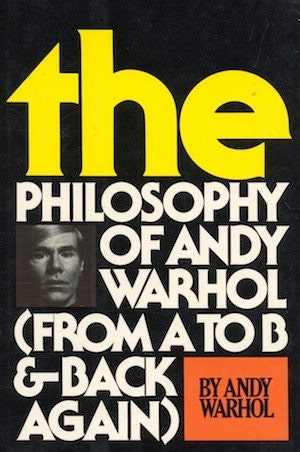
This quirky memoir's dust jacket turns the traditional usage of emphasis and capitalization upside down, giving the lowercase definite article top-billing on its cover. Don't criticize it, it's art! The understated McDonald's color scheme is a nice touch as well. As usual, Andy Warhol's only contribution to this work was collecting the paycheck.